Thursday, 5 December 2013
Previous student digipak research
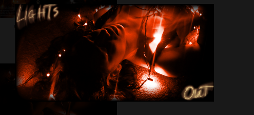
This digipak was produced by a previous student, personally out of all the ones I looked at tis one was my favourite. I think it followed the conventions of a digipak very well for example the colours work really well and are the same inside and outside, the font as well is smile. the whole digiak is simple yet effective, it grabbed me as a member of the audience
They made sure they incorporated the idea of lights which i'm guessing is their synergy.
They made sure they followed the do's and don'ts by not putting any text over the artist face, making sure the font style was simple and bold.
The only weakness would be tht the pictures could have perhaps been clearer because of the fact that they are introducing a new artist.
Here is a digipak from a previous student which i think didn't do as good, due to many reason.
I think the main think that i dont like about it is the colours of the font because it stands out to much, i think they should have kept more simple colours would have made it more effective, also where they placed their fonts.
Labels:
Farha Osmani
Subscribe to:
Post Comments (Atom)


No comments:
Post a Comment